Web UXP (Pro version only)
Pro template ready to create a full Universal EXPerience.
- Fully Adaptable UI that uses well known and widely used TS/JS components: A responsive and fast multi-language interface that delivers a consistent experience across all devices and screen sizes.
- Rapid Customization via JSON: Easily configure menus, page titles, translations, and icons through simple JSON files, enabling fast deployment and content updates without code changes.
- Role-Based Navigation: Personalize the user experience by dynamically adjusting menu options based on the user's security role or permissions.
- Integrated, Rich-Media Help System: Provide comprehensive user support with an HTML-based help system that's easily styleable and supports images and videos for clearer instructions.
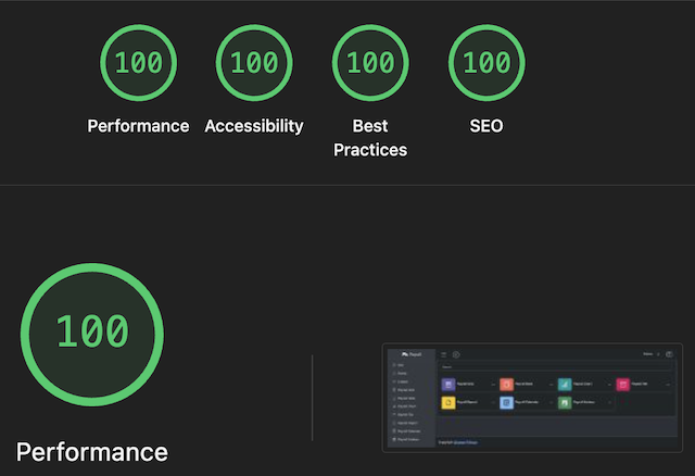
Fast and responsive
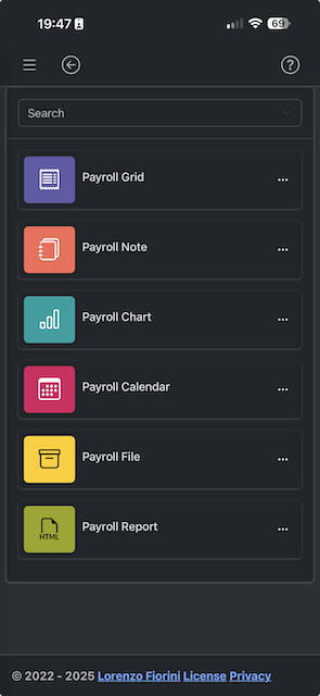
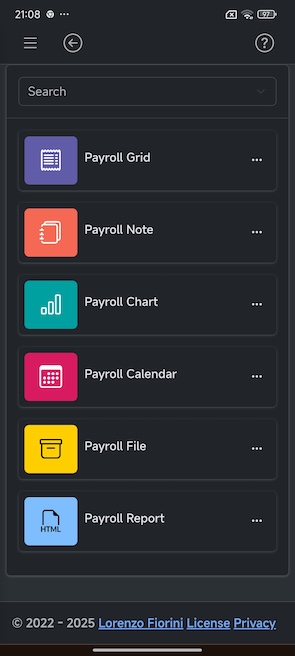
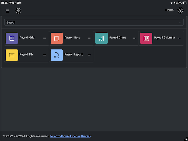
Universal UI for Windows, MacOS, Linux, iOS, Android, Chrome OS Flex, ...
| iOS | Android | iPadOS | Chrome OS Flex |
|---|---|---|---|
 |  |  |  |
Multilingual LTR/RTL support
| Change language at runtime | LTR/RTL |
|---|---|
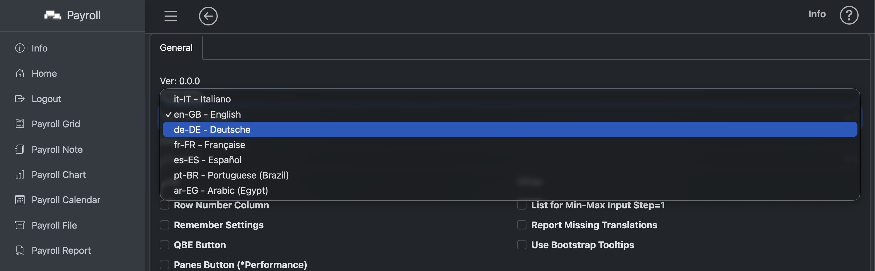 | 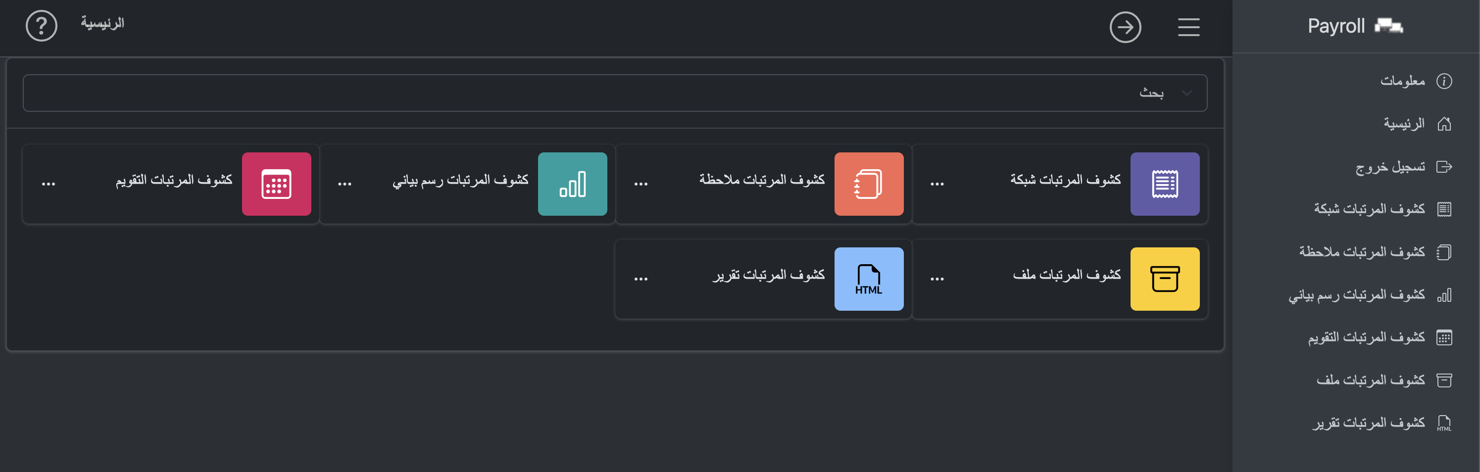 |
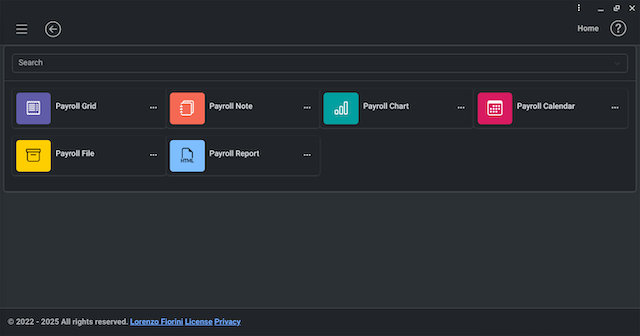
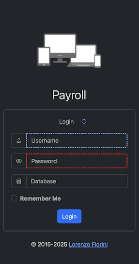
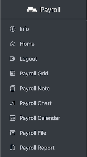
Login page, Sidebar Menu
| Login page | Sidebar Menu |
|---|---|
 |  |
Page Header

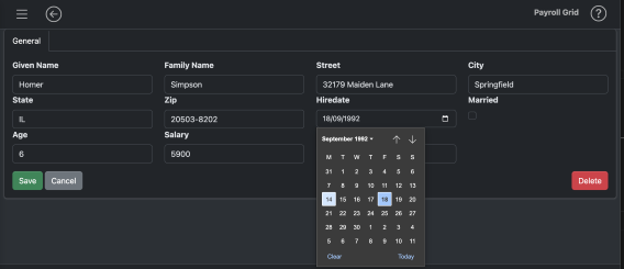
Forms
- Fields can be generated automatically from a view model that defines which fields to render, position, attributes and css classes using:
- @FieldsFromModel().
- The data binding is done with only 2 function:
- renderForm(data, formId)
- data = processForm(formId).
- With 3 functions calls a form edit is done.
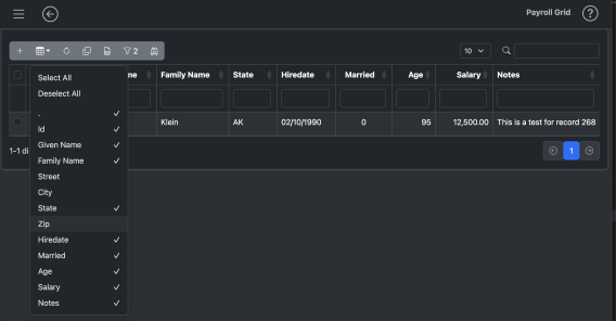
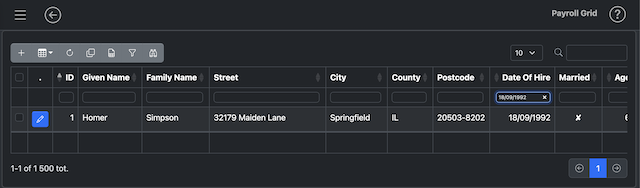
Grids
- Grids can be generated automatically from the data returned from the API without the need of define each column but it is always possible to customize many column properties, add virtual columns with calculations, set special rendering and so on. Adding a grid can be as easy as:
  const res = getApiUrlAsync('url...', { params... });
  renderAutoDataTable(res['rows'], {div: 'div_id', colFormats: res['formats'],});
Grid Header

-
Add (user defined)
- if defined, the buttons are present also in case of empty result set. They used to add rows, typically showing an empty form and execute a api post to add the row.
-
Grid standard (always available)
- show/hide columns
- reset settings
- copy data to the clipboard
- export grid as a XLSX file
- export grid as a PDF file (if enabled)
- select/deselect rows
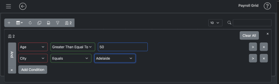
- Builder Filter (if enabled)
- Panes Filter (if enabled)
-
Application defined (user defined)
- these buttons are defined by the developer and they can do any kind of tasks. They are kept separated because they can flow below the main toolbar in smatphones or smaller devices.
-
Rows per page (always available) Set number of rows that the pagination shows.
-
Global search (always available)
- Select the rows that contains the search string.
| Grid Show/Hide Columns | Grid Panes Filter |
|---|---|
 | 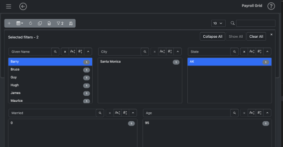 |
| Grid Builder Filter | Grid Column Filter |
|---|---|
 |  |
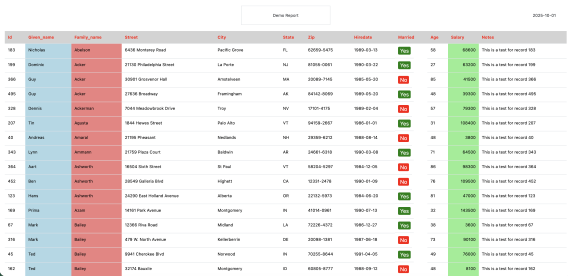
File Upload/Download and Html Reports
| File Upload/Download | Quick Html Reports ready to print |
|---|---|
 |  |
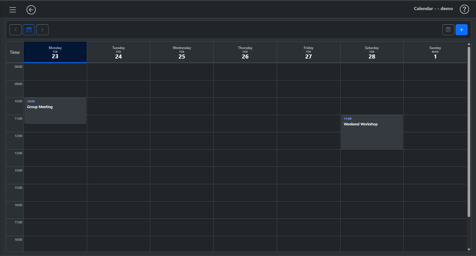
Calendar
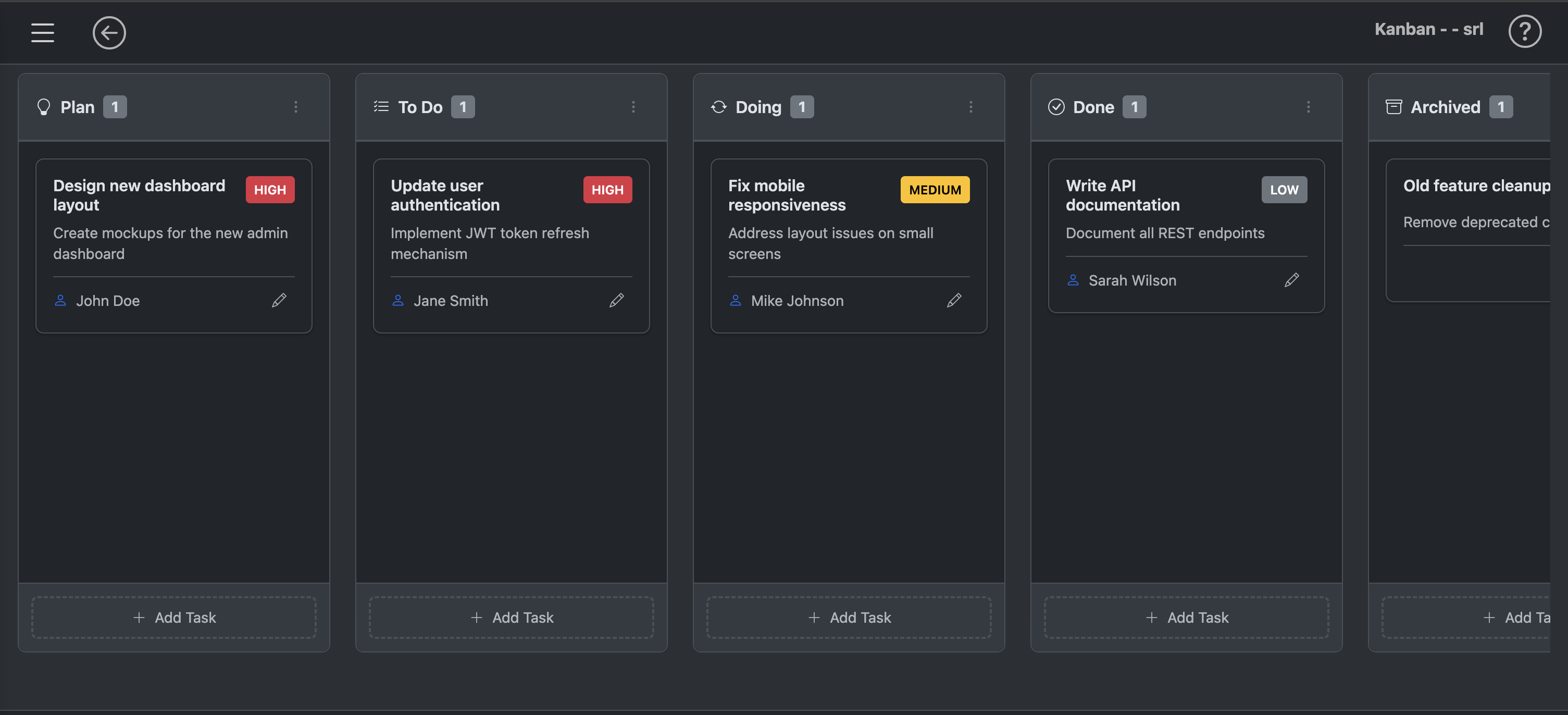
Kanban
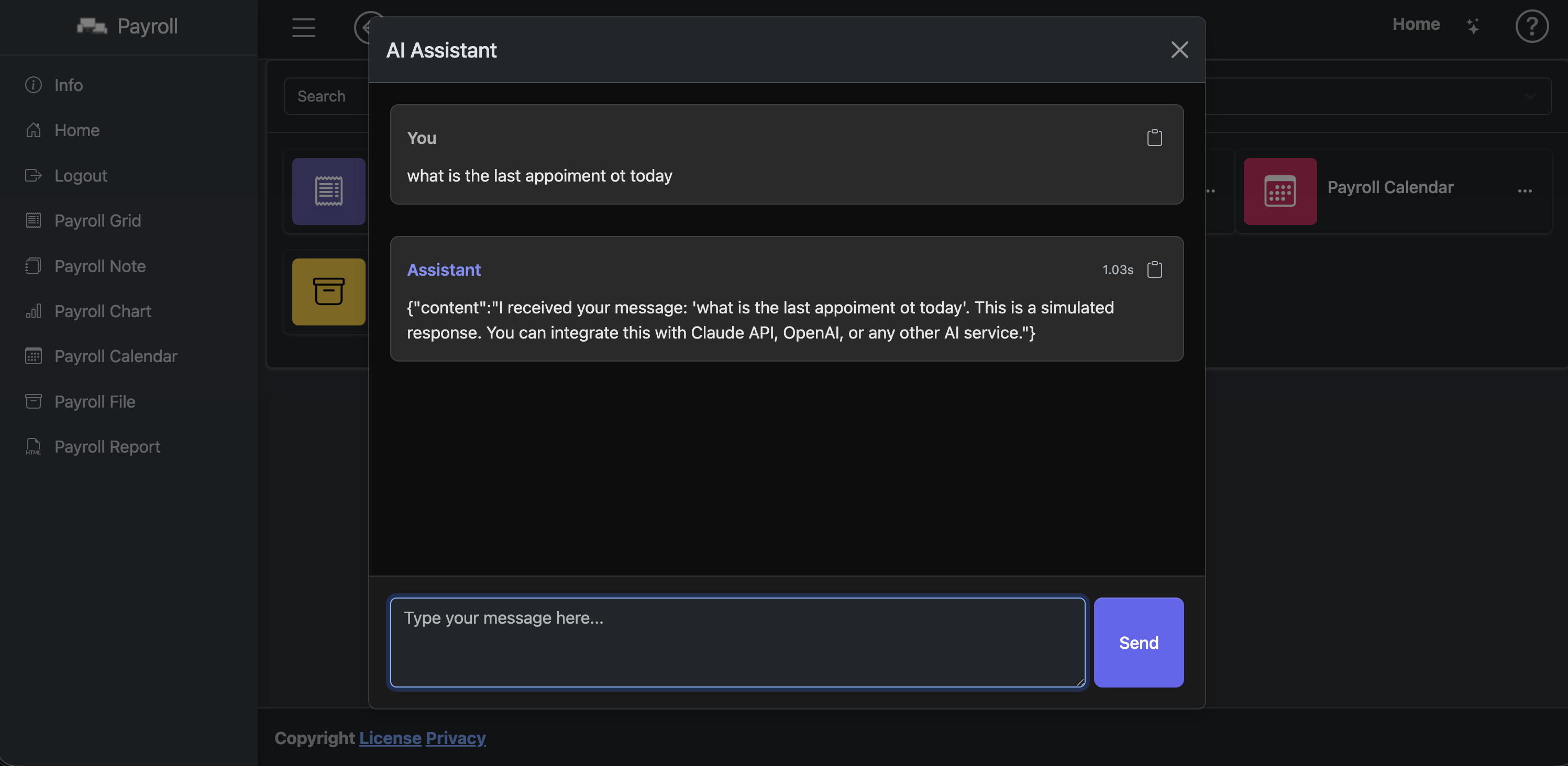
AI Chat
Includes a collection of ready-to-use page templates integrated with leading JS libraries. (Note: Use of certain third-party libraries may require separate licensing or fees.)
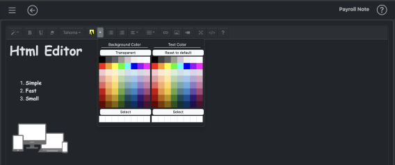
| Html Editor | Charts |
|---|---|
 | 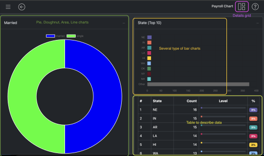 |
| Maps | FullCalendar |
|---|---|
 | 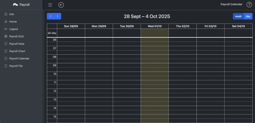 |